Lembar 03 · Survei lokasi · 7°38′S 112°54′E

Service marketplace website 2026

KreasiKita

A static marketplace website for creative digital services, with a filterable catalogue, tiered service packages, a validated order brief and order confirmation.

HTML5 CSS3 JavaScript (vanilla) Lucide Icons Google Fonts (Anton, Inter, Space Mono) WebP
Peran Front-end Developer and UI Designer
Tahun 2026
Stack HTML5, CSS3, JavaScript (vanilla), Lucide Icons
Tim Solo build
Ringkasan

Masalah yang perlu diselesaikan project ini

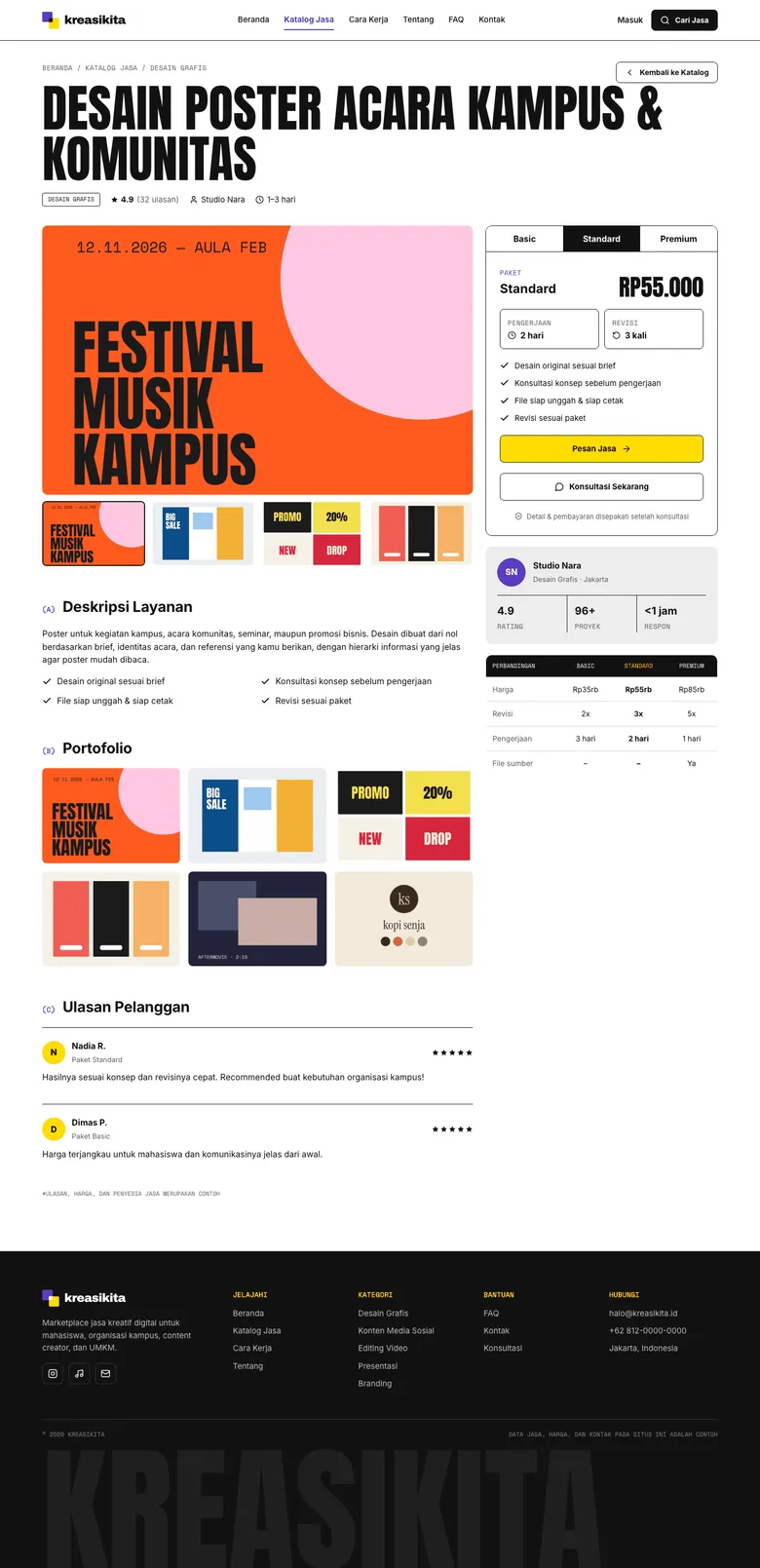
KreasiKita is a static website for a creative digital services marketplace that connects students, campus organisations, content creators and small businesses with providers of graphic design, social media content, video editing, presentations and branding. It covers the full user flow, from searching for a service and comparing packages to filling in an order brief and receiving an order confirmation. The site has 17 pages built with plain HTML, CSS and JavaScript, with no framework and no build step. All provider names, prices, reviews and contacts are sample data for the portfolio.
Pembingkaian masalah

Dari workflow yang berantakan menjadi requirement produk yang lebih jelas.

Pekerjaan dimulai dengan memisahkan kebutuhan operasional staf dan kebutuhan customer, lalu mengubahnya menjadi requirement produk yang lebih jelas.

Tantangan

Apa yang membuat pekerjaan ini menantang?

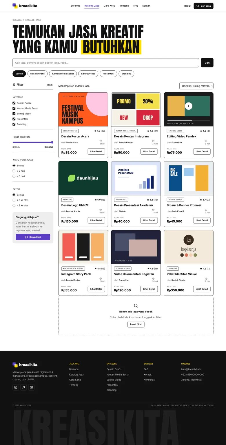
Creative services for campus events and small businesses are usually scattered across social media accounts, so clients have to compare portfolios, prices and turnaround times by hand. The challenge was to present nine different services in one structured place and make the ordering flow feel complete without any backend. The forms are not connected to a server, so validation, price summaries and the confirmation step all had to run in the browser.

Kebutuhan user dan bisnis

Apa yang perlu dibuat lebih jelas?

Clients such as students, campus organisations and small business owners need a simple way to find the right creative service, see examples of work, understand what each package includes and send a clear brief. Without structured information on price, revisions and turnaround, choosing a provider and explaining the job takes many back-and-forth messages.

Process

Bagaimana project bergerak dari requirement ke flow yang usable.

01

The visual direction is editorial and bold: large uppercase Anton headings, thin black divider lines and a restrained palette of purple (#5B3CC4) for the brand, yellow (#FFDD00) for highl...

Solusi

Apa yang saya bangun dan kenapa itu penting

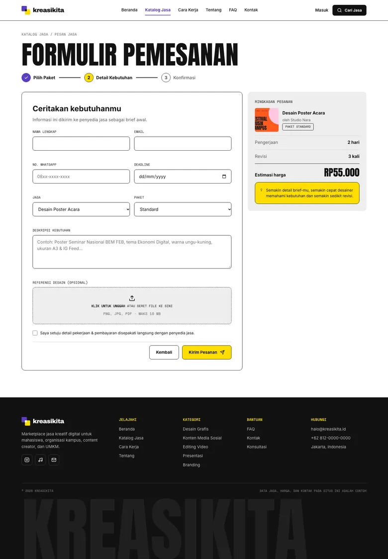
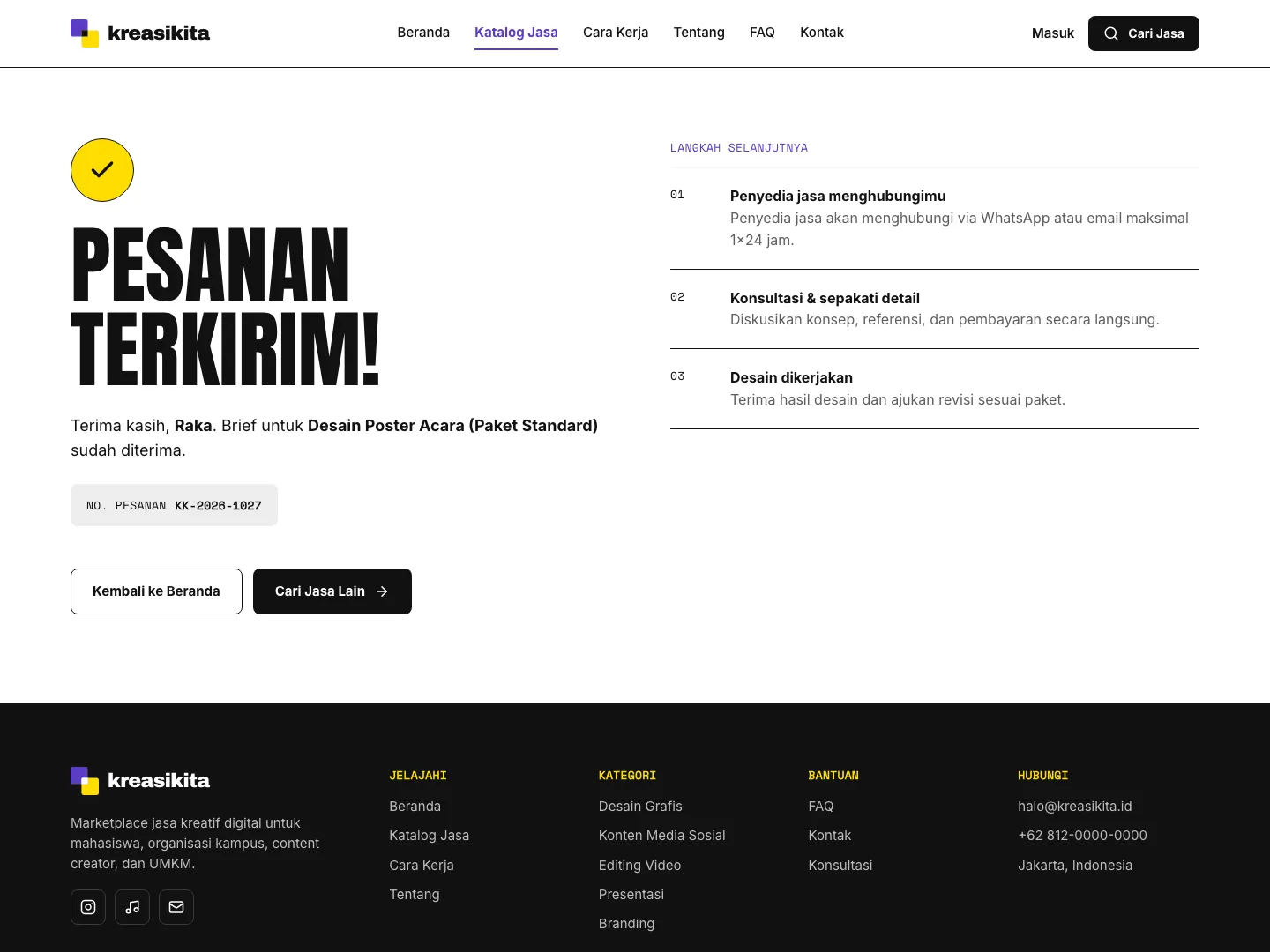
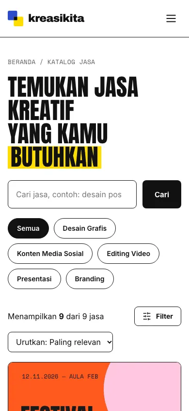
The catalogue lists nine services with category chips and checkboxes, a maximum price slider, turnaround time, minimum rating, keyword search and sorting, and filters can also be opened from the URL. Each service detail page has a portfolio gallery with thumbnails, Basic/Standard/Premium package tabs operable with arrow keys that update price, duration, revisions and the order link, a provider profile, a comparison table and reviews. The order form validates name, email, WhatsApp number, deadline (no past dates), minimum description length, reference file size and consent, and updates the price summary when the service or package changes. The confirmation page shows the customer name, service, package and an order number in the KK-2026-xxxx format, and the site includes a searchable FAQ, a prefilled contact form, a mobile menu, a skip link, visible keyboard focus and reduced-motion support.

Hasil

Dampak dan bukti pendukung

The site demonstrates a complete marketplace ordering journey that runs entirely in the browser and can be opened directly from index.html or served with a simple local server. It shows how service packages, portfolio samples and a structured brief can replace scattered chat-based ordering. Its accessibility details, such as keyboard-friendly package tabs, a skip link and reduced-motion support, make the flow usable beyond mouse users.

Refleksi

Apa yang ditunjukkan case ini tentang cara saya bekerja.

Start from the real workflow before deciding the interface structure.

Make system states visible so users know what happened and what to do next.

Write interface copy that reduces follow-up questions, not just fills empty space.