Community website 2026

Narasi Digitall

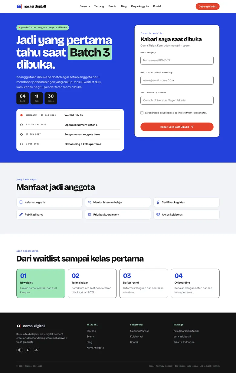
A community website for a digital literacy and storytelling group, with event registration, a blog, a member gallery and an open-recruitment waitlist.

HTML5 CSS3 JavaScript Google Fonts Lucide Icons WebP
Peran Front-end Developer and Designer
Tahun 2026
Stack HTML5, CSS3, JavaScript, Google Fonts
Tim Solo build
Ringkasan

Masalah yang perlu diselesaikan project ini

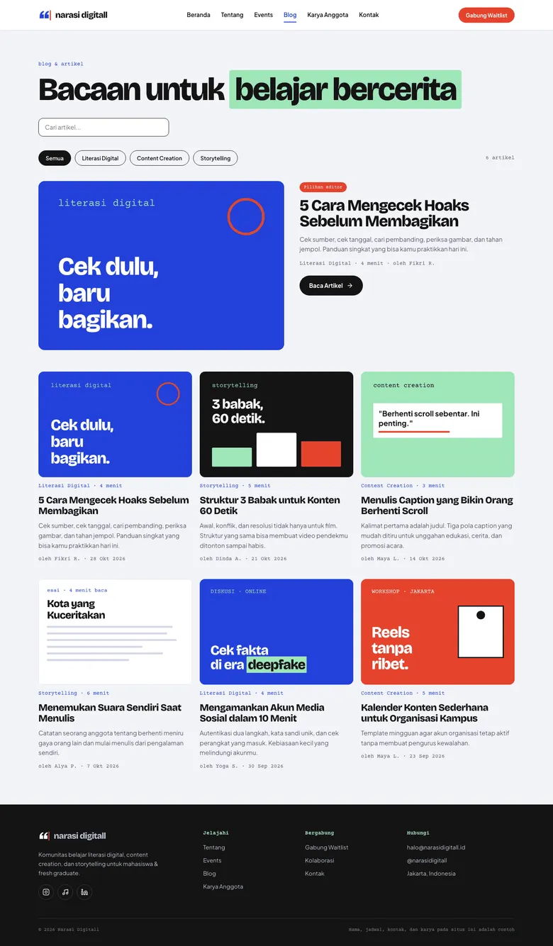
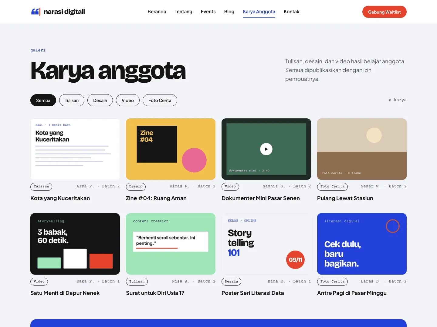
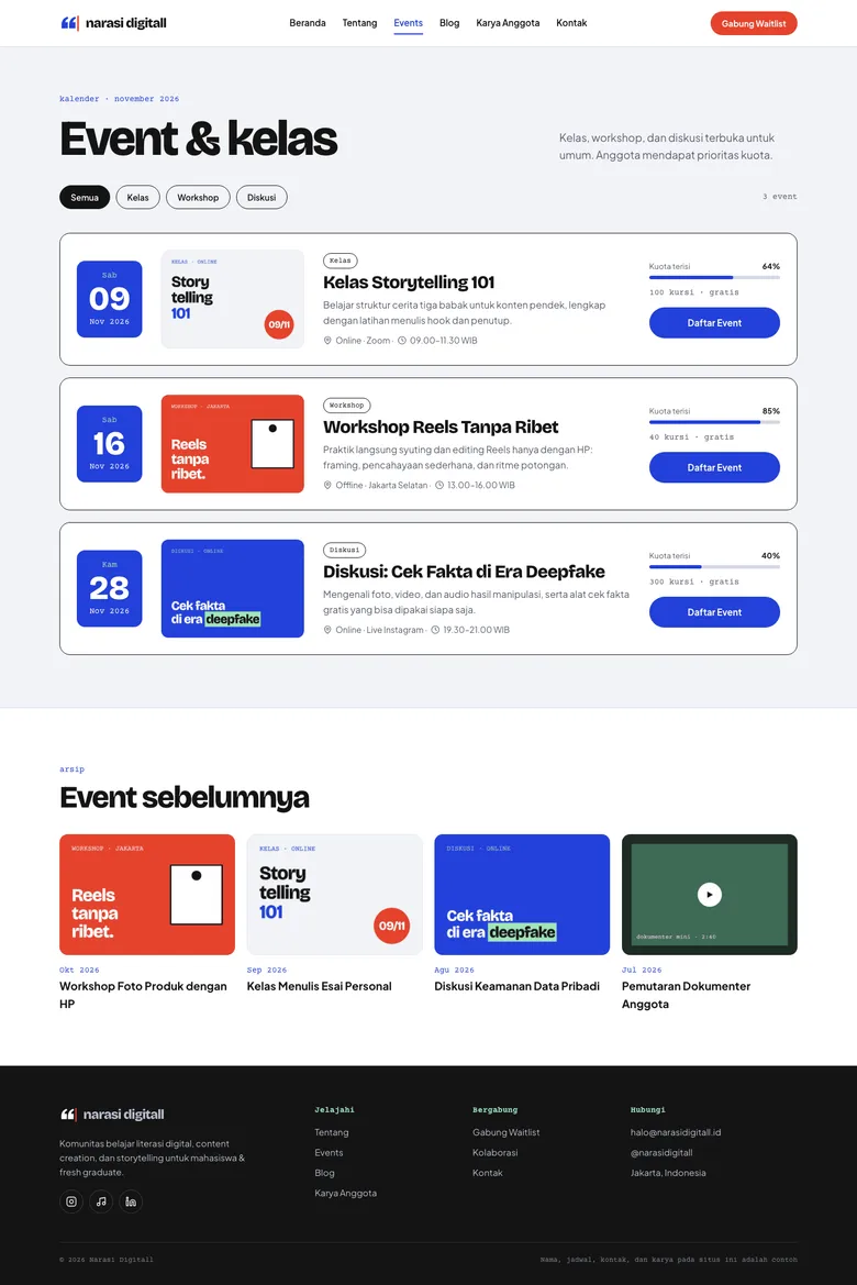
Narasi Digitall is a static website for a learning community focused on digital literacy, content creation and storytelling for university students and fresh graduates. It acts as the community's information hub, with a profile page, an event schedule with registration, a blog with full articles, a gallery of member work and a waitlist for the Batch 3 open recruitment. It is built with plain HTML, CSS and JavaScript, without a framework or build step, and is responsive on desktop, tablet and phone. Names, schedules, contacts, articles and works on the site are sample content for portfolio purposes.
Pembingkaian masalah

Dari workflow yang berantakan menjadi requirement produk yang lebih jelas.

Pekerjaan dimulai dengan memisahkan kebutuhan operasional staf dan kebutuhan customer, lalu mengubahnya menjadi requirement produk yang lebih jelas.

Tantangan

Apa yang membuat pekerjaan ini menantang?

A volunteer community needs one place where newcomers can understand what it does, see upcoming classes and sign up, without relying on scattered social media posts. Membership opens in batches, so interest has to be collected before recruitment actually starts. The site also had to stay simple enough to host and maintain without a backend or build tooling.

Kebutuhan user dan bisnis

Apa yang perlu dibuat lebih jelas?

How might a small learning community present its programs, events, writing and member work in one clear place, and capture interest for its next recruitment batch, using only static web technology?

Process

Bagaimana project bergerak dari requirement ke flow yang usable.

01

The visual identity is based on a stationery theme: pen blue as the main color, editor red for calls to action, highlighter green for key words, HVS paper as the page background and ink f...

Solusi

Apa yang saya bangun dan kenapa itu penting

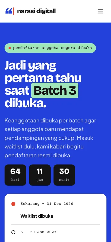
The site has eight main pages plus three full articles: home, about, events, blog, member works, join waitlist, waitlist confirmation and contact. The waitlist form validates name, email or WhatsApp number, campus and consent, then shows a confirmation page with the person's name, contact and a queue number in the ND-B3 format, alongside a countdown to the recruitment opening date. Events can be registered through a native dialog with validation and a toast notification, and the events, blog and member works pages offer filters and search with result counts and empty states. Accessibility details include a skip-to-content link, visible keyboard focus, a mobile menu and support for prefers-reduced-motion.

Hasil

Dampak dan bukti pendukung

The site gives the community a single, shareable hub for its programs, events, articles and member work. Prospective members can join the Batch 3 waitlist and see the recruitment timeline in a few steps, and visitors can register for events or reach out for collaboration through the contact form. Forms are not connected to a server; data is processed in the browser to demonstrate the user flows.

Refleksi

Apa yang ditunjukkan case ini tentang cara saya bekerja.

Start from the real workflow before deciding the interface structure.

Make system states visible so users know what happened and what to do next.

Write interface copy that reduces follow-up questions, not just fills empty space.